Migress Associació
Migration, social and solidarity economy with its own voice.
2023
The project
MigrESS —Associació Migració i Economia Social i Solidària— was born in 2016 as part of the first Postgraduate Course in Social and Solidarity Economy, coordinated by La Ciutat Invisible and supported by the XES. Their work is as concrete as it is necessary: to open up real space for migrant and racialized people within an economy that claims to put “people at the center”. But their communication didn't match their mission: the original hand-illustrated logo lost its legibility in small sizes and on screen, and there was no website capable of organizing their history, projects, publications and transparency.
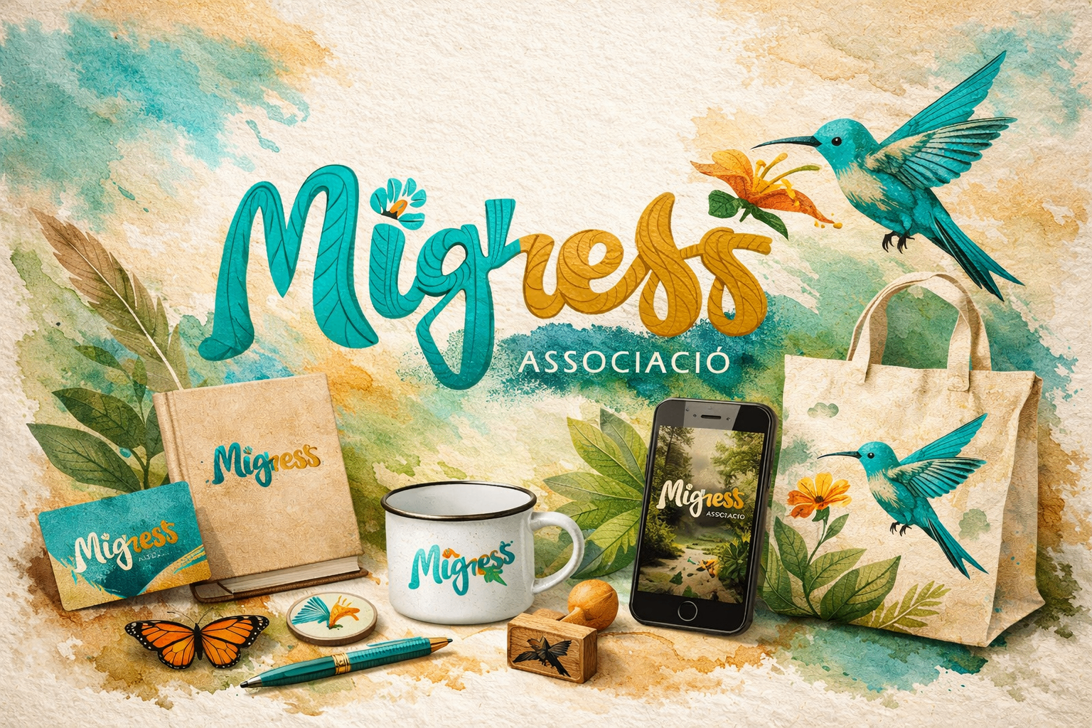
We redesigned the logo, preserving its illustrated soul—the organic calligraphy and the hummingbird as a symbol of movement and freedom—and brought it into a solid digital system: refined linework, a turquoise and ochre palette, white versions for photography and guaranteed minimum sizes. On that foundation, we built the bilingual corporate website (català/castellano) with a clear editorial architecture: who we are, team, what we do, track record, transparency, publications, news and contact. Real photography of the community, flat colour blocks and a generous typographic hierarchy ensure every text is effortless to read.
Services
- Logo redesign
- Visual identity
- Corporate website
- UX/UI
- Content architecture
Category
Logo + web redesign
Year
2023
01 — The live site
migress.cat
The website in action: bilingual, editorial, and designed so that anyone —a neighbor, entity, or public administration— can understand at a glance what the social and solidarity economy is from a migrant perspective.
02 — Renewed identity
A hummingbird that keeps flying
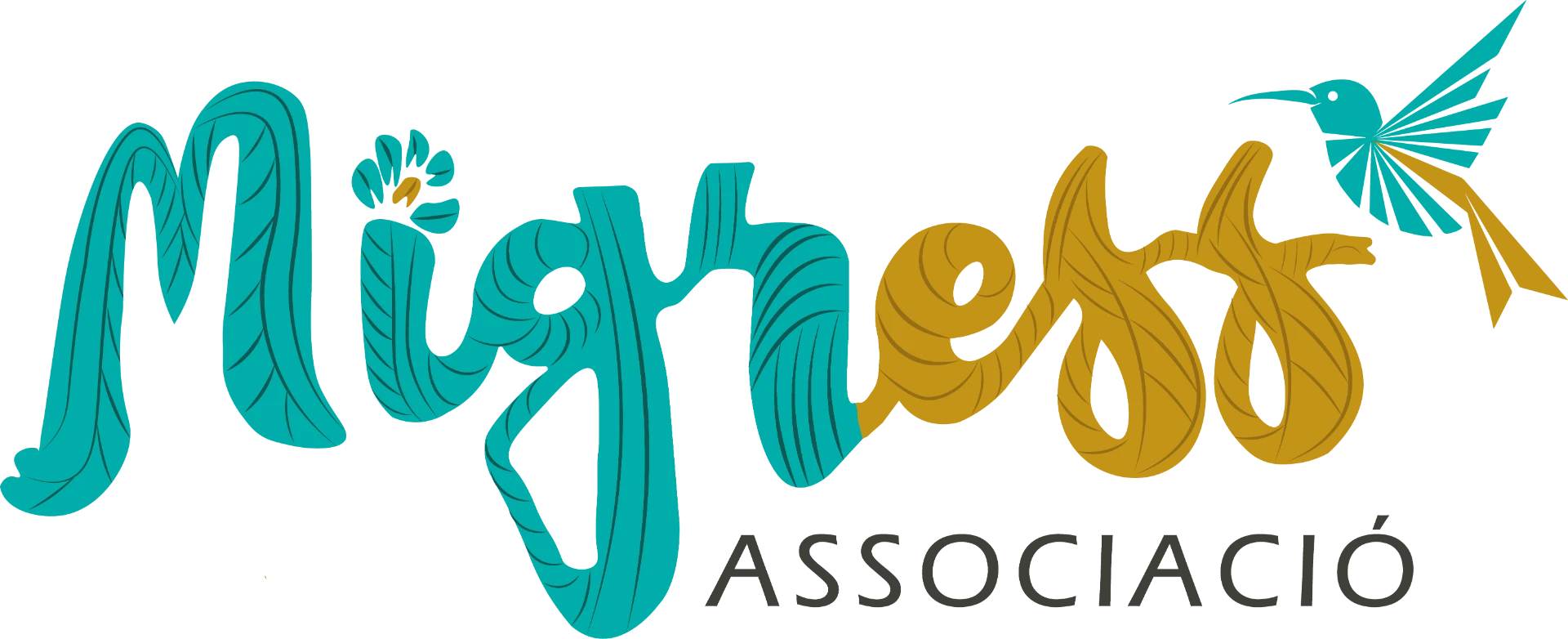
The redesign keeps the original illustrated calligraphy and the hummingbird, but refines the linework, defines the turquoise and ochre two-tone colour scheme, and adds negative versions to work with photography. The brand gains legibility without losing its warmth or artisanal character.
Movement and freedom
El colibrí
The hummingbird crosses borders, pollinates wherever it goes and does not belong to a single place. It is the perfect synthesis of migration: small, tireless and necessary for the ecosystem. In the logotype, it flies within the word, not apart from it.
Root, bond, and care
El bejuco
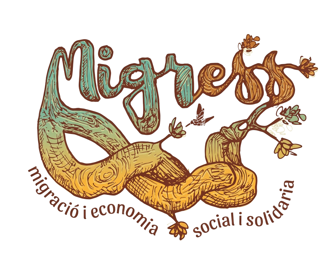
The *bejuco* is the vine that climbs, twines and supports: it grows by leaning on others. Its strokes draw the lettering itself —knots, shoots and leaves— and turn the word Migress into a living fabric of community and solidarity economy.
What changed
- Refined linework: the vine is also legible at small sizes.
- Hummingbird defined as a distinct sign within the composition
- Turquoise and gold two-tone stabilised for screen and print
- Negative version for use on real photography.
Technical sheet
Identity system
The Migress logotype is built with hand-drawn lettering that integrates its own isotype —the hummingbird and the flower— within the composition. Both elements form a single visual signature: they are not separable pieces.
Brand nature
- Organic and custom lettering
- Isotype integrated into the composition
- Illustrative details that add character
- Turquoise + gold colour contrast
Relationship of elements
The isotype is not an external addition, but a structural part of the logotype. The main version always respects the proportion and position of the original art.
Main colour palette
Turquesa
HEX #00A8A8 · RGB 0 / 168 / 168
Main lettering, isotype and accents
Dorado
HEX #D2A016 · RGB 210 / 160 / 22
Second block of lettering and illustrative details
Dark grey
HEX #303030 · RGB 48 / 48 / 48
«Associació» tagline and supporting texts
Guideline values taken from the original reproduction. CMYK/Pantone equivalencies should be validated depending on the print medium.
Safe area
A clear space must be maintained around the logo, equivalent to at least the height of the reference graphic module. Nothing should enter this area.
Minimum size
30 mm wide
Digital
120 px wide
Below these sizes, the details of the lettering are lost: always check for legibility before applying.
Negative version
The brand on dark backgrounds
The negative version does not invert the original colours: the lettering becomes pure white and the hummingbird remains gold, which gains presence on deep backgrounds. It should always be applied on dark, uniform surfaces, with enough contrast to prevent the lettering strokes from closing up.
Color versions
Each background has its own version
Application examples
Dos and don'ts
Correct uses
Incorrect uses
The main version always remains true to the original art. Any adaptation preserves its recognition, its proportion, and the brand's illustrated personality.
03 — The corporate website
A platform for a mission
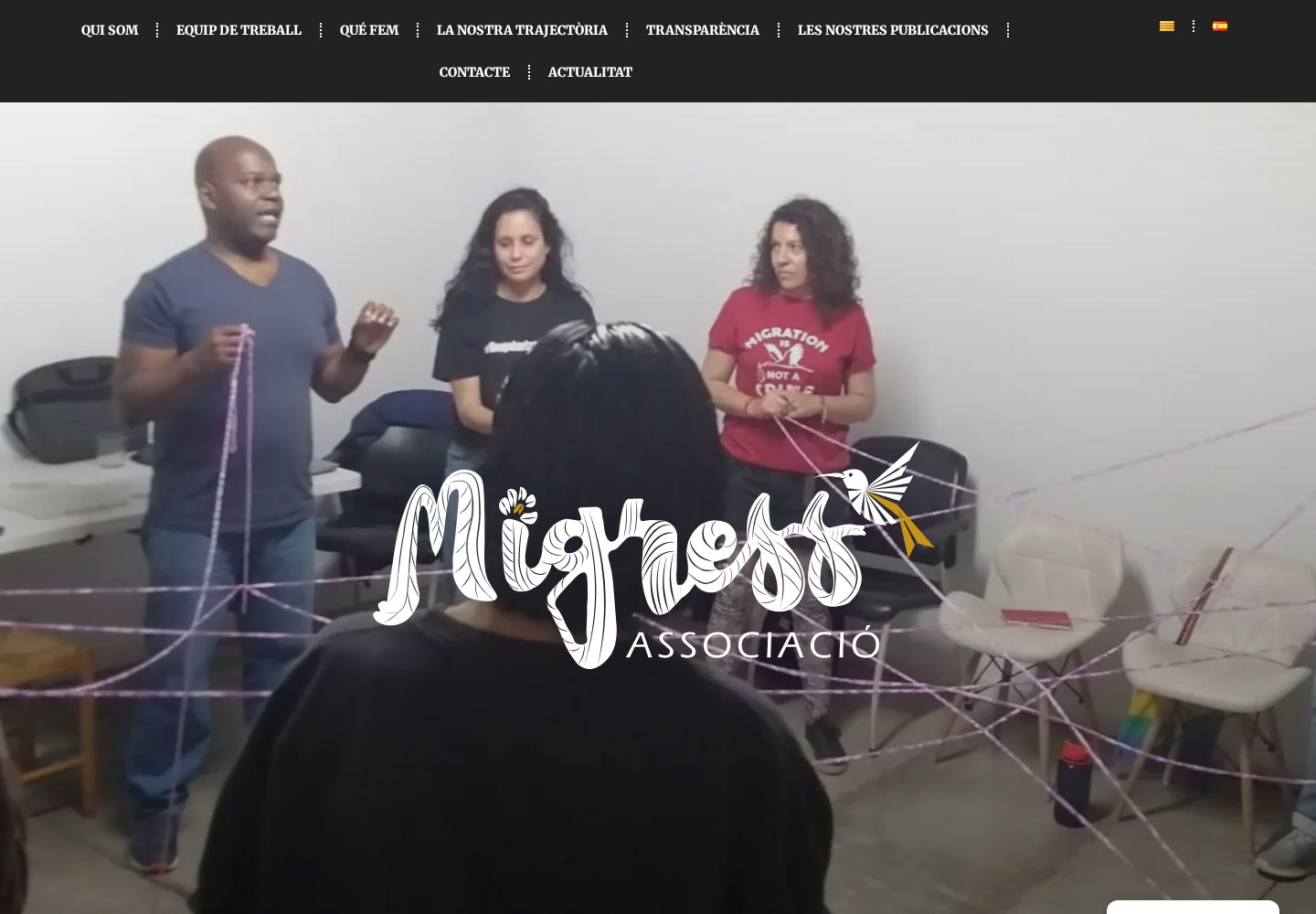
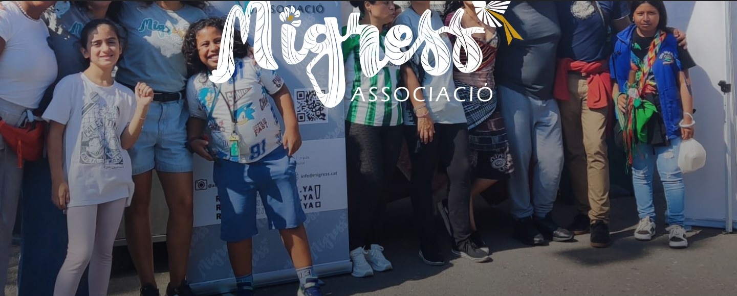
Homepage with a community video and the brand in white over a real image, bilingual navigation and sections ordered by what the association needs to communicate: who they are, what they do, their history and their transparency.
04 — What they do
The services, organized and navigable
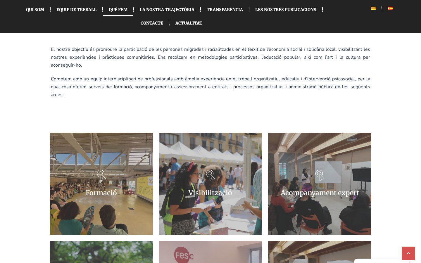
The «Què fem» section explains the association's objective and displays its areas of work —training, visibility, expert support, advocacy, fairs, and projects— in a grid of cards with real photography, where each area can be expanded to be read in detail.
05 — Track record and transparency
Two sections that build trust
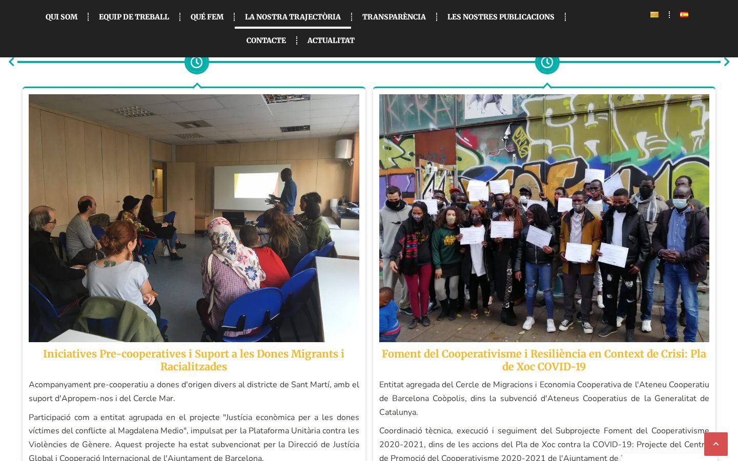
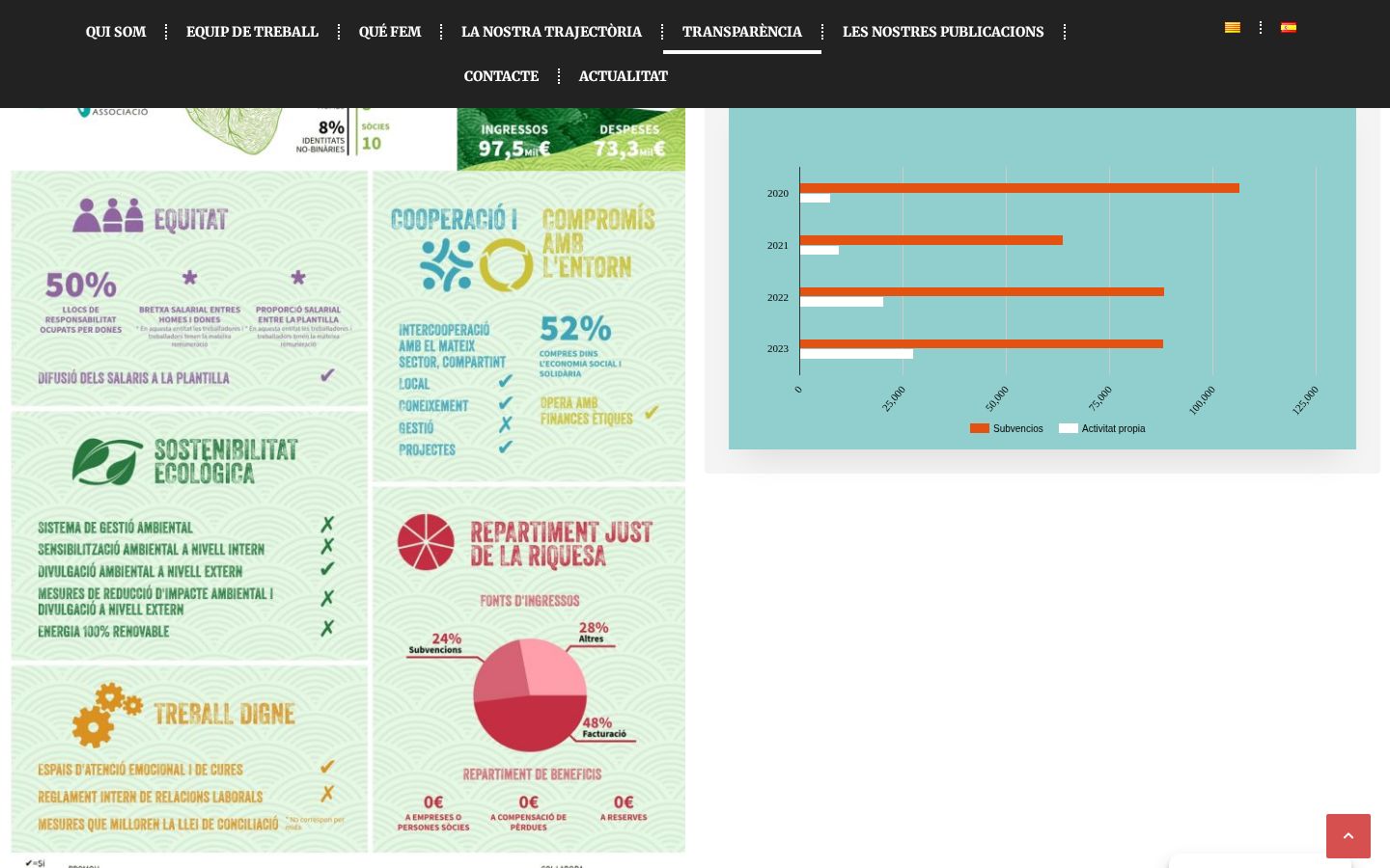
«La nostra trajectòria» was designed as a navigable, year-by-year timeline, with photography and a description of each project. «Transparència» publishes the social balance, the financial report, and income charts: public information, readable, and with no mandatory downloads.
06 — Publications, news, and contact
The public voice and the gateway
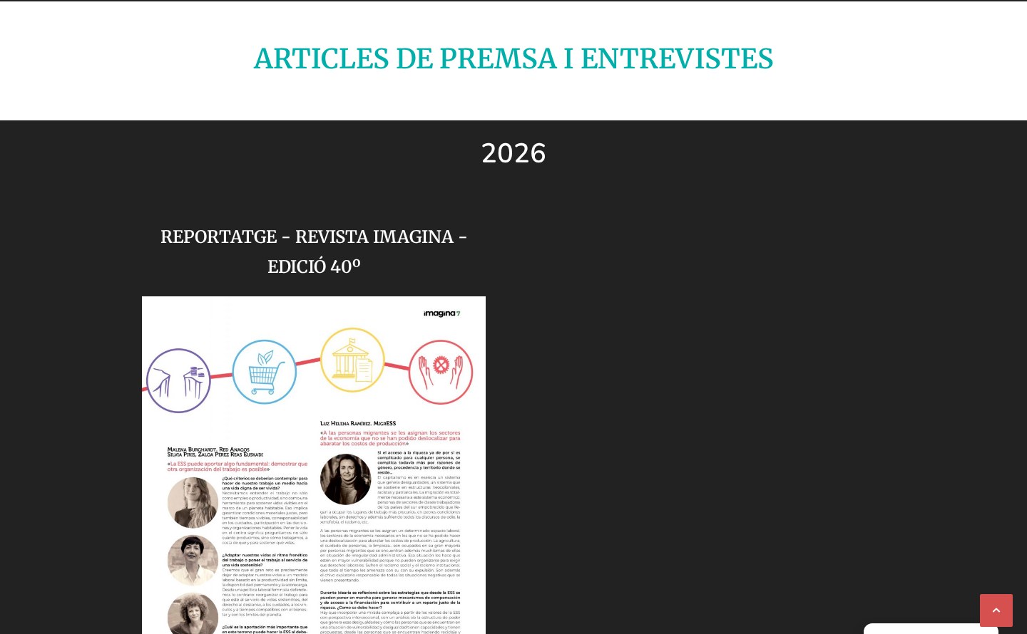
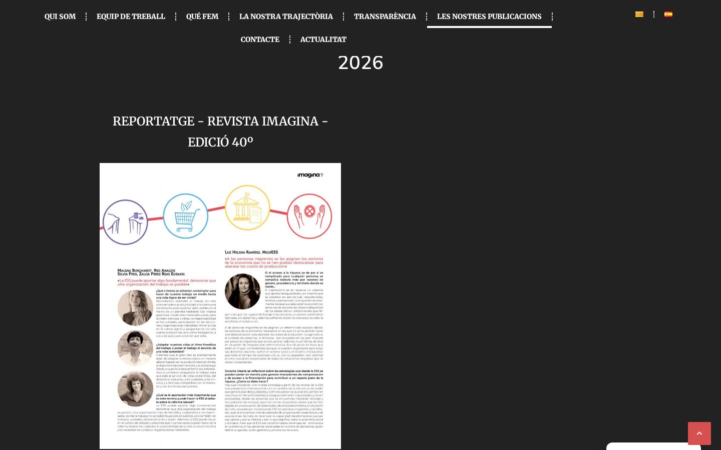
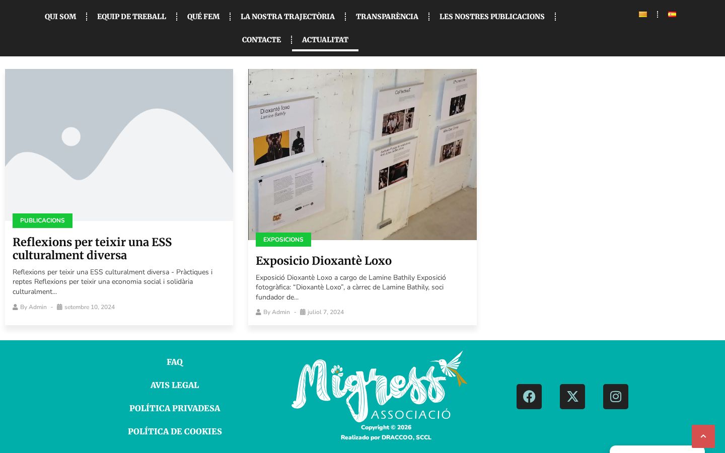
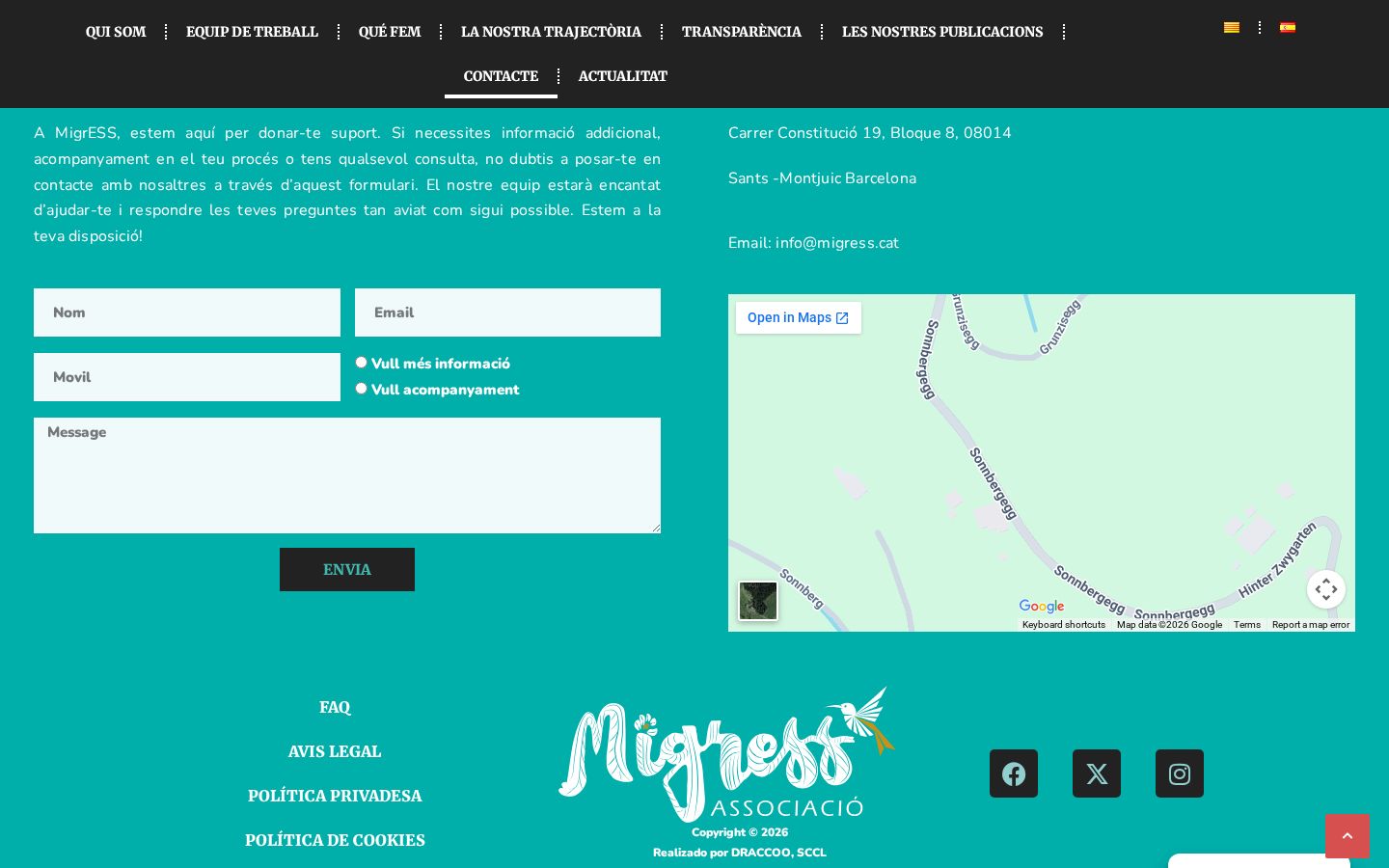
«Les nostres publicacions» archives by year the reports, magazines, and studies in which the association participates. «Actualitat» functions as a blog with categories. And «Contacte» brings together a form with a reason for inquiry, address, email, and map, along with a frequently asked questions section.
07 — The community on the street
Solidarity, migrant, and diverse economy
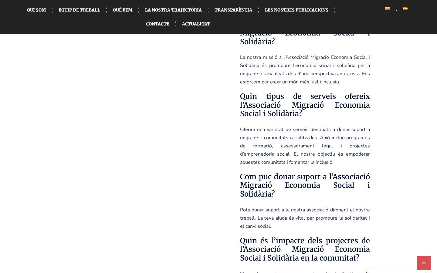
La Fira d'Economia Solidària Migrant i Diversa is the visible heart of Migress: a market, meeting place, and platform for advocacy all in the same space. The identity was designed for this context —posters, T-shirts, banners, mobile— where it needs to be legible from one meter away and from twenty.
08 — Recognition
An award-winning work
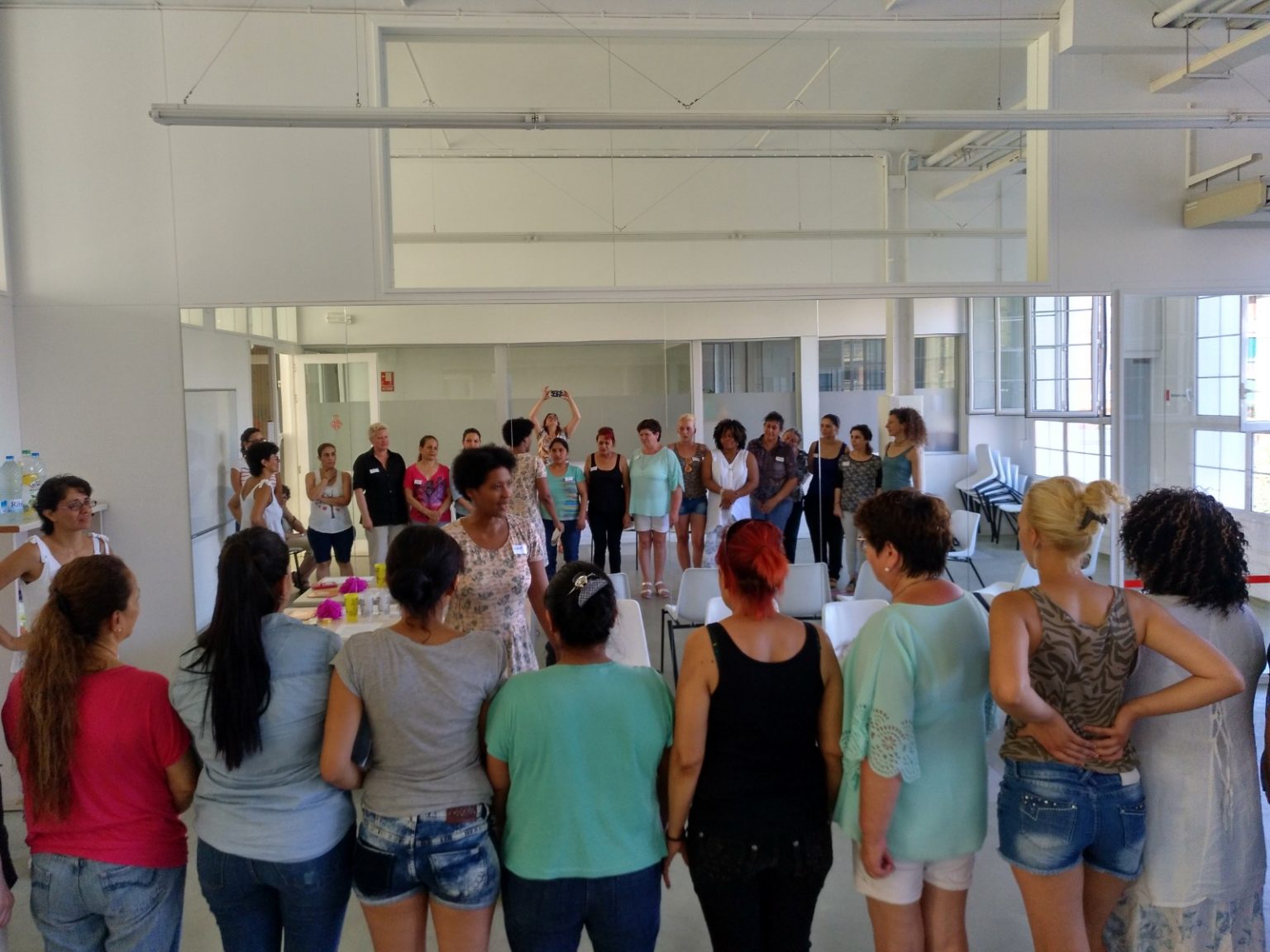
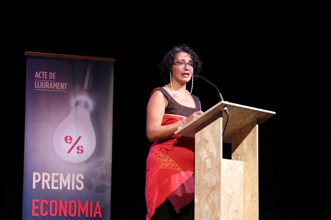
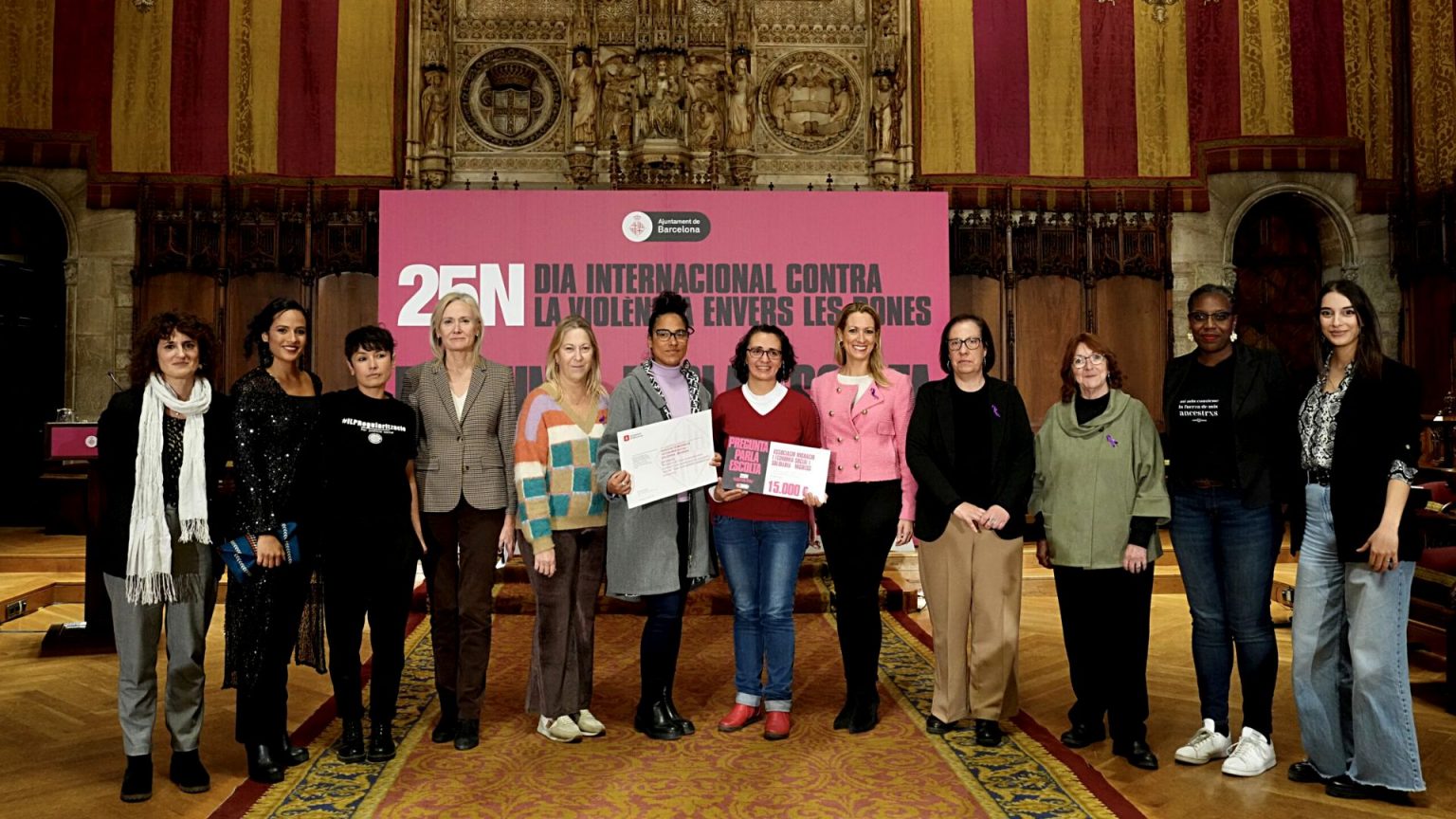
Migress's trajectory has been publicly recognized for its contribution to the social and solidarity economy and for its work against gender-based violence alongside migrant women. The website organizes and gives visibility to these milestones, which were previously scattered across social media and press releases.
09 — Track record
Years of work with the migrant community
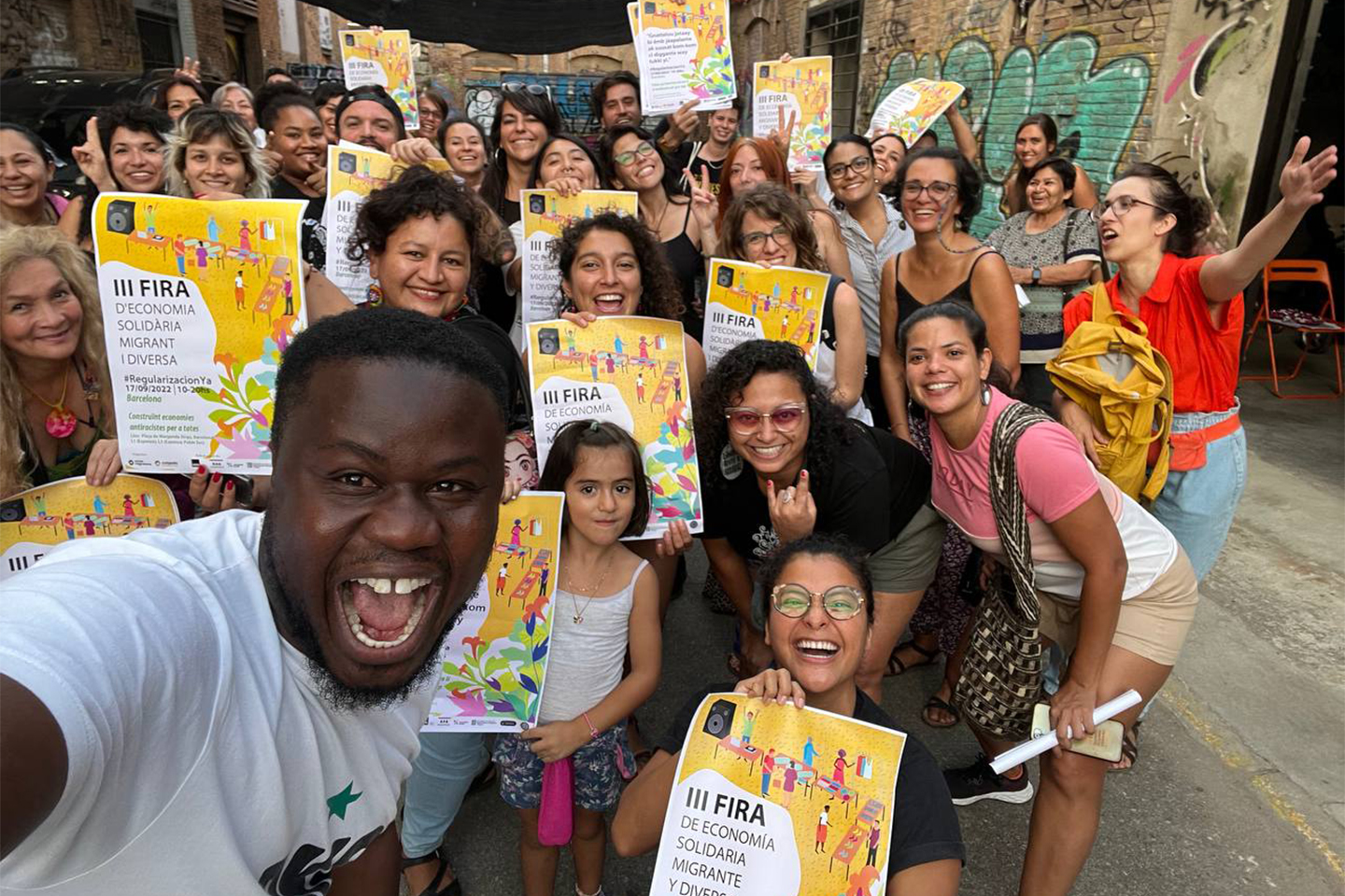
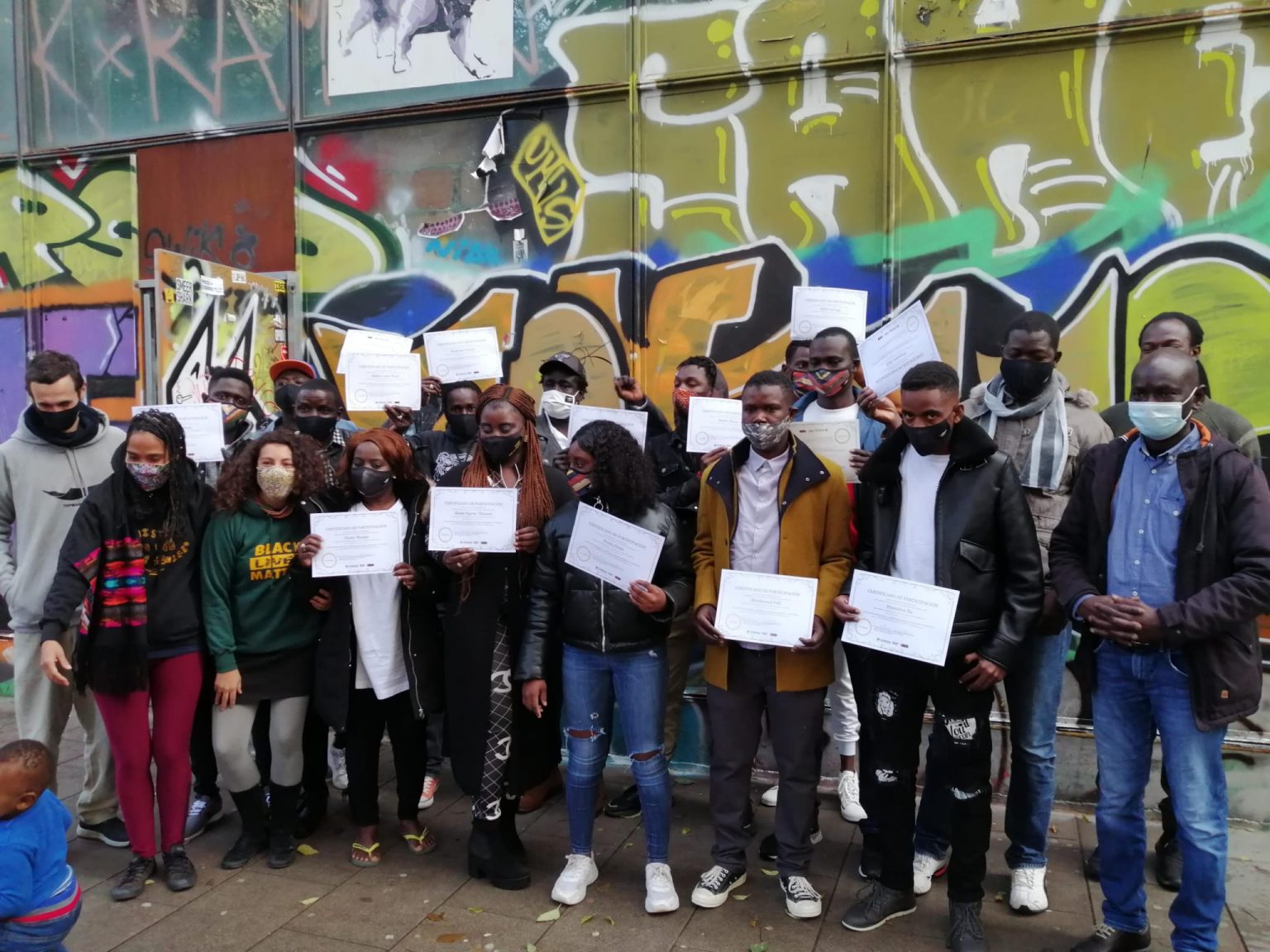
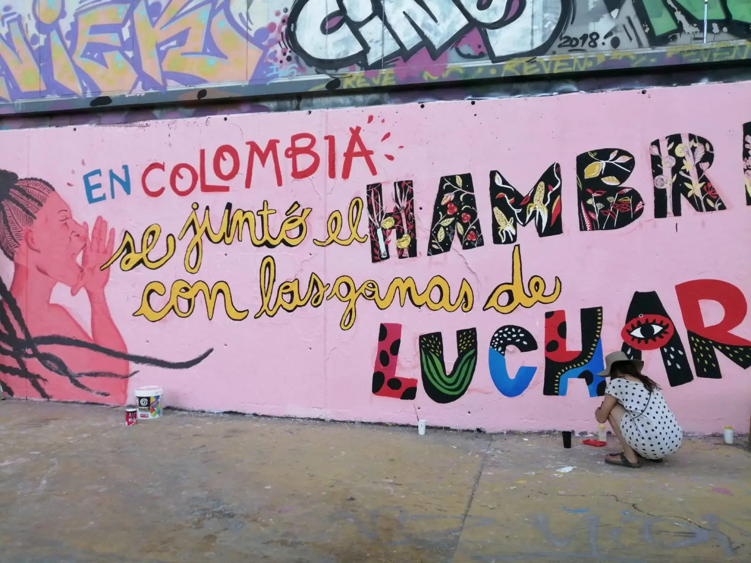
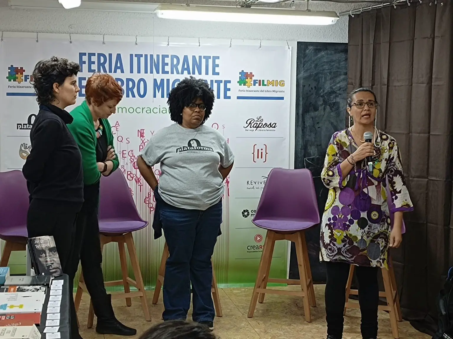
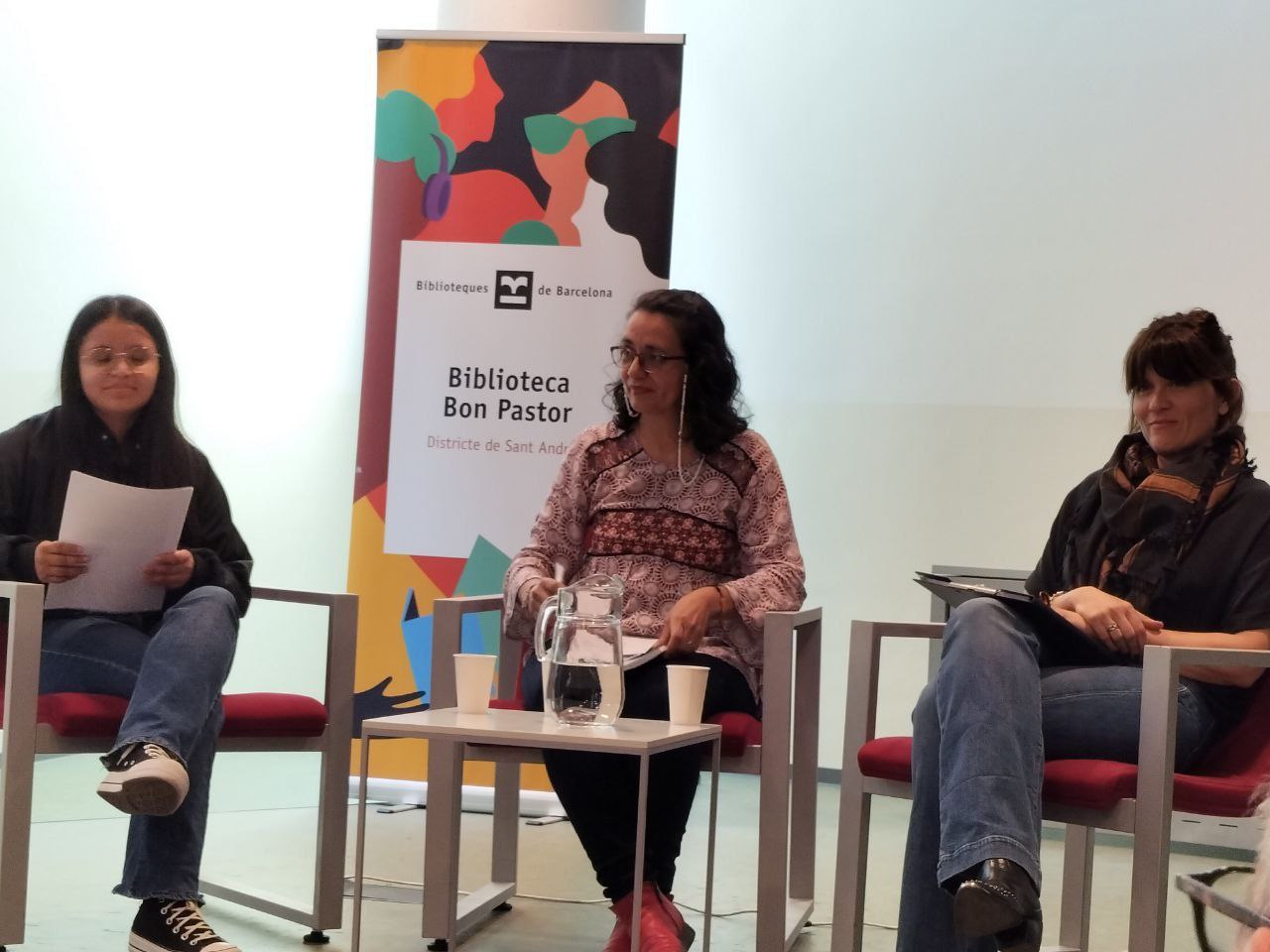
Training sessions, murals, migrant book fairs, gatherings in squares and libraries. The identity and website were designed to support this living archive: a journey that grows each year and needs a place to be told with order and pride.

Result
Today, Migress has an identity that works just as well on a trade show roll-up, a T-shirt or a press headline, and a website that upholds its institutional voice: it presents their projects, documents their history, publishes their articles and interviews, and makes their transparency visible. The association went from relying on scattered pieces to having its own platform from which to speak to public administrations, solidarity economy networks and its own community.
Before y After
A side-by-side look at the change: from the starting point to the final system applied.
Estado: Antes. Punto de partida
Hand-illustrated logo, dense and not very legible in small or digital formats.
Estado: After. Result
Redesigned logo that preserves its essence, with a clear and editorial corporate website.