
Abilys Curlys
Vegan products for afro and curly hair, with a new visual voice.
2025
The project
Abilys Curlys is a vegan product brand for afro and curly hair. Before our intervention, their communication relied on improvised assets: heavy typography on saturated backgrounds, messages in text blocks with no hierarchy, and an inconsistent visual system across their homepage, product campaigns, and social media.
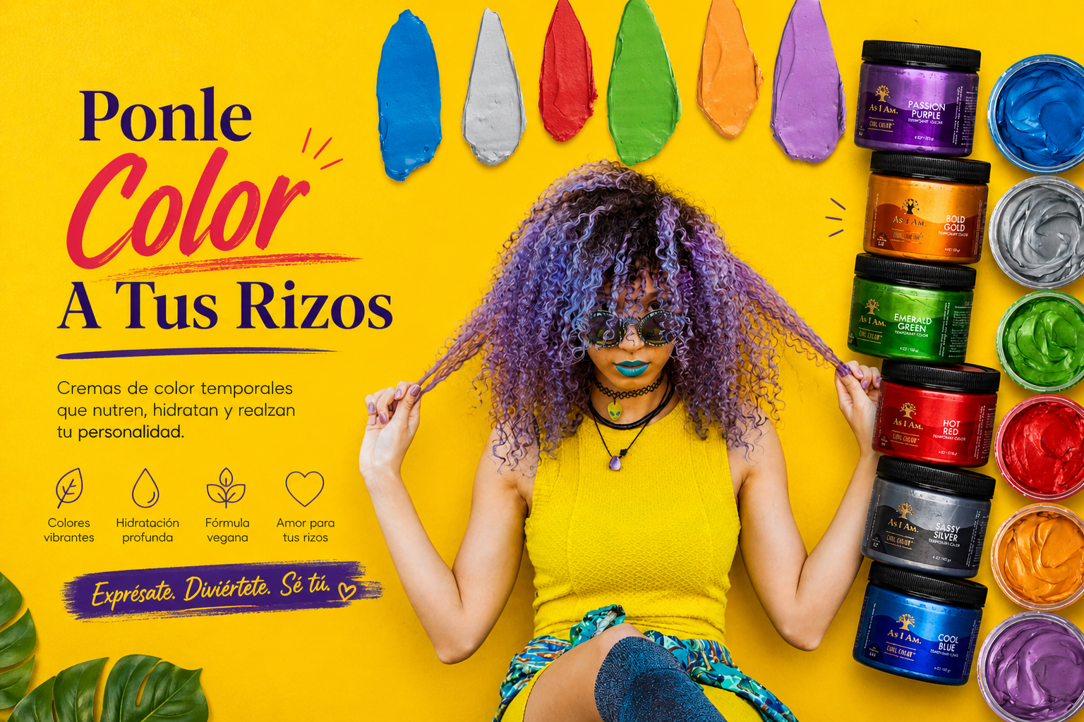
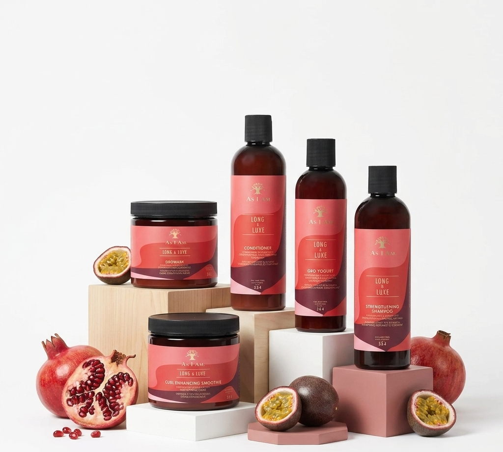
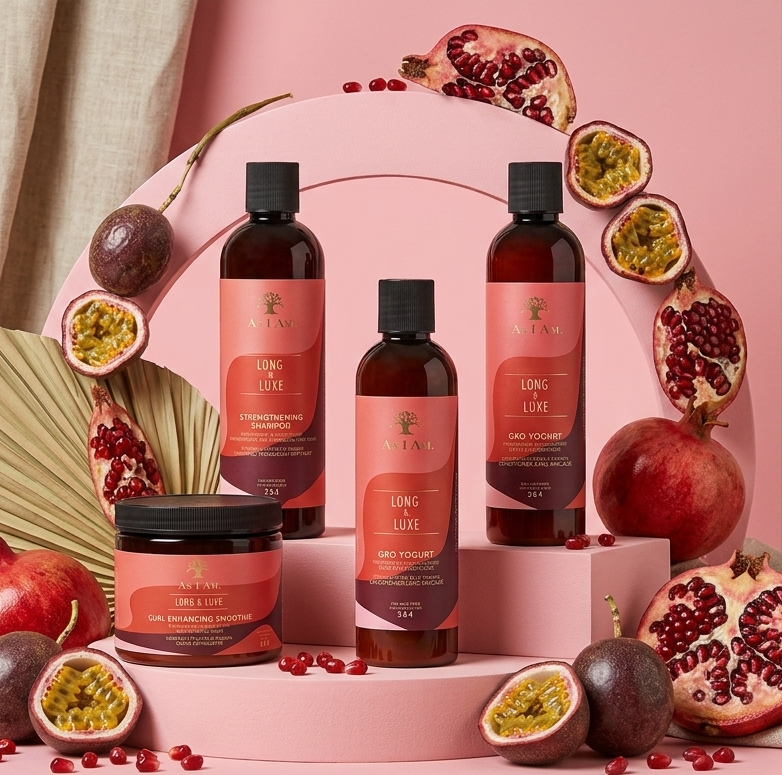
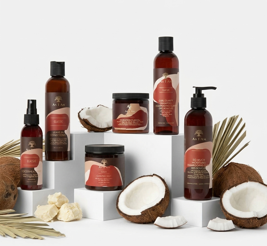
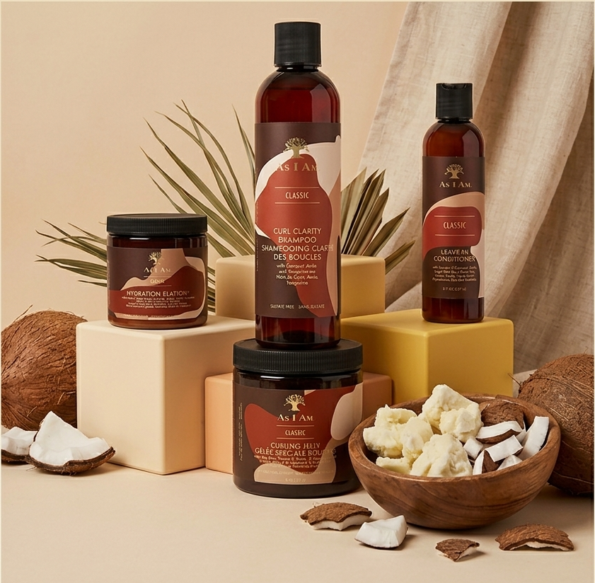
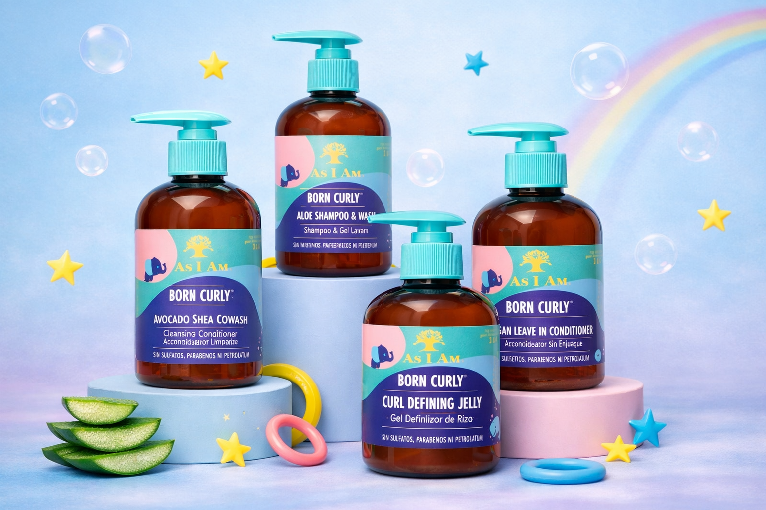
We built a warm, editorial visual system: a typographic hierarchy with an expressive serif, a curly-yellow palette with coral and teal accents, clean photography focused on hair texture, and an icon system for brand values (vegan, natural, all curls, made with love). We applied the system to campaign covers, product packs (Born Curly, Ponle Color a Tus Rizos), and social media communications with a clear manifesto: 'Love your curls. Care for them as they deserve.'
Services
- Digital design + Website
- Social media sales strategy
Category
Digital marketing + Website
Year
2025
01 — Website and online store
Website and online store
02 — Before and after
From the starting point to the visual system
El punto de partida
Before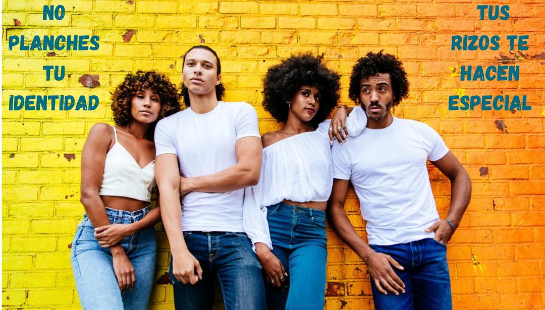
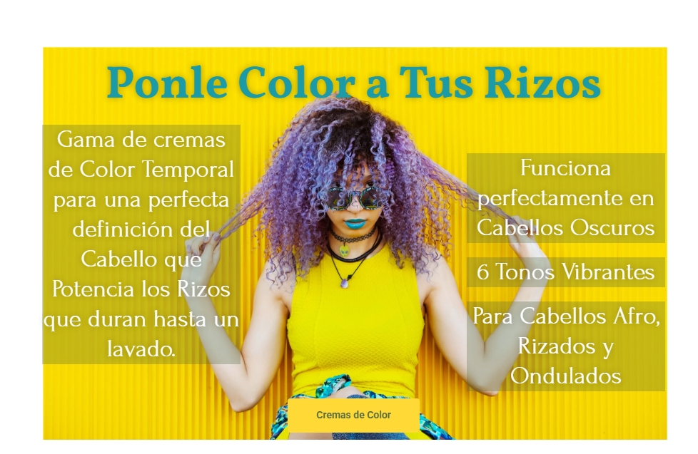
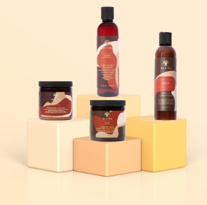
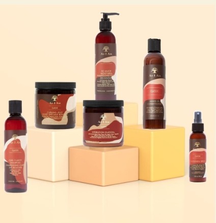
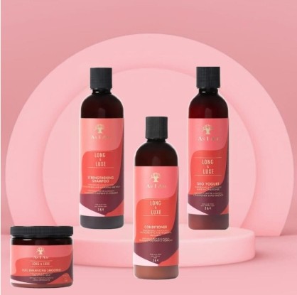
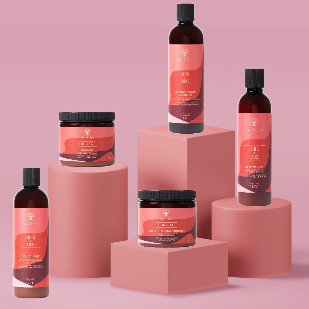
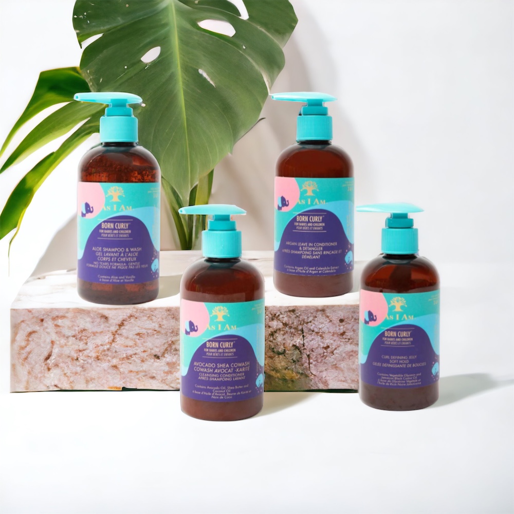
Homepage — before
El sistema visual
After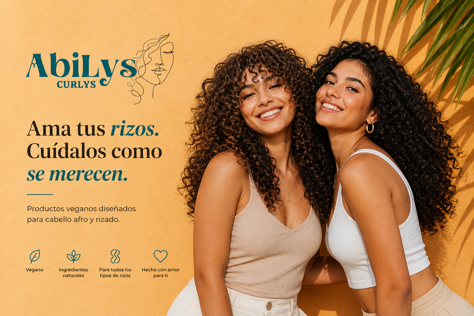
PORTADA Abilys Curlys 2
03 —
Social media sales strategy
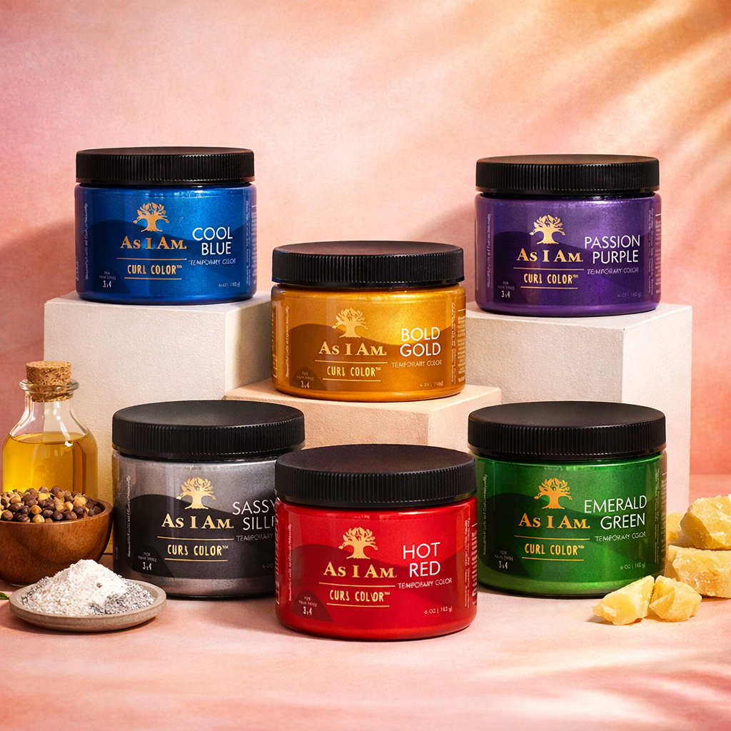
An audiovisual campaign to promote the Curl Color Cream Collection: temporary color for defined, vibrant curls. Six intense shades that color without damage — emerald green, silver, cool blue, intense red, bold gold, and passion purple. One video for each element, designed to capture attention on social media and convert it into sales.
The 6 elements
Result
A recognizable and coherent identity across all touchpoints: covers that breathe, product campaigns that showcase texture and color, and a brand tone that celebrates curly identity instead of hiding it. The brand went from communicating with noise to communicating with intention.
Before y After
A side-by-side look at the change: from the starting point to the final system applied.
Estado: Antes. Punto de partida
Cover with busy typography, stacked messages on saturated backgrounds and no clear visual hierarchy.
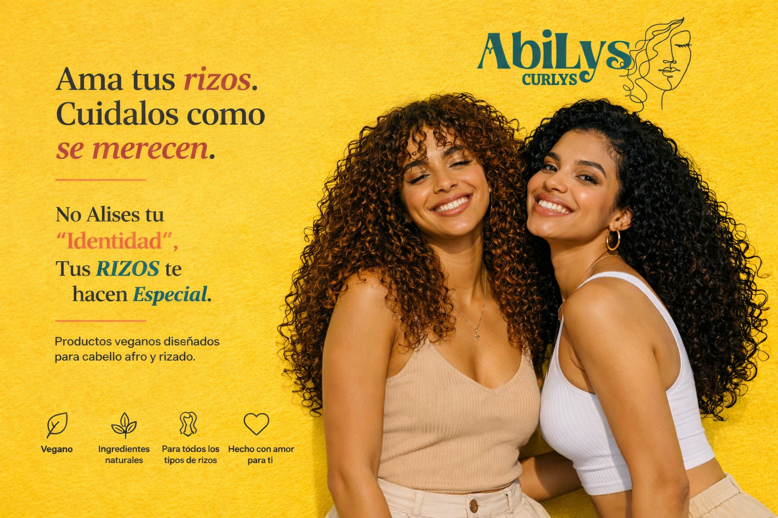
Estado: After. Result
Editorial cover with an expressive serif, a warm palette and a clear message: 'Love your curls. Care for them as they deserve.'